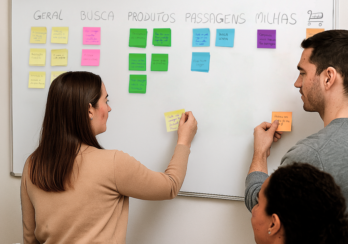
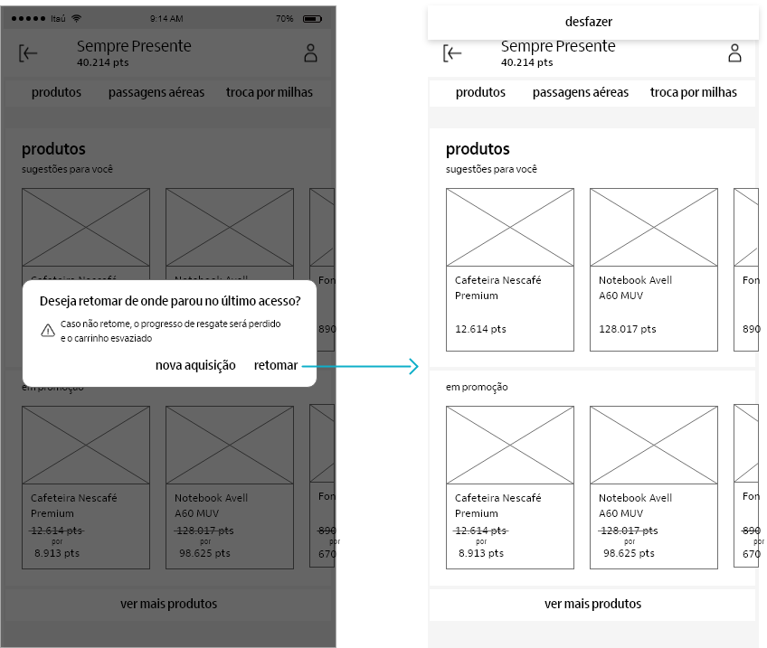
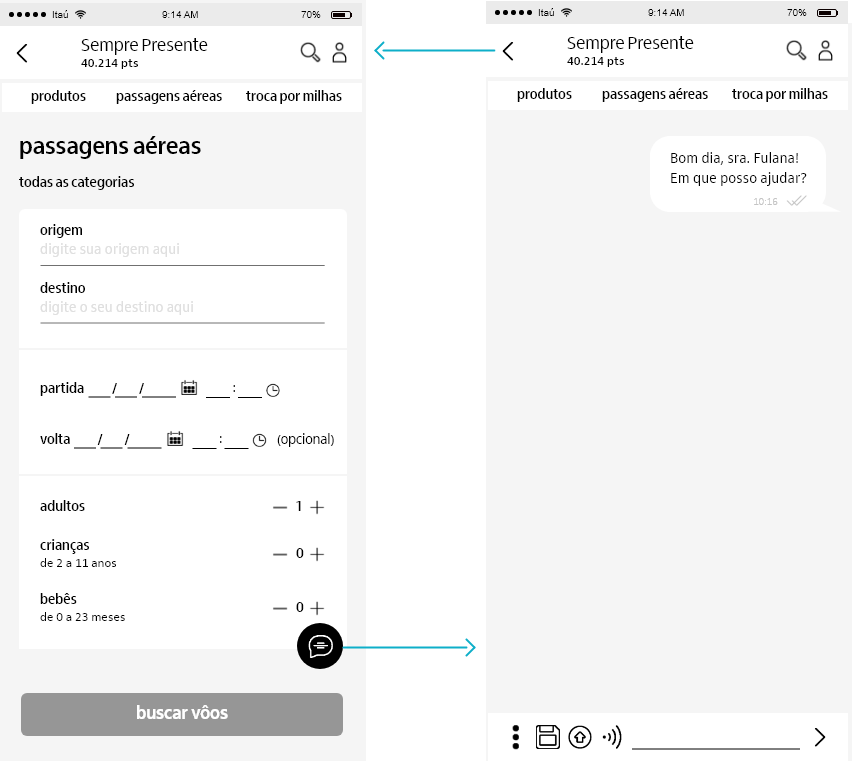
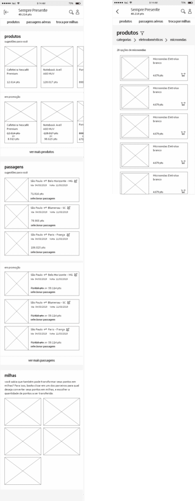
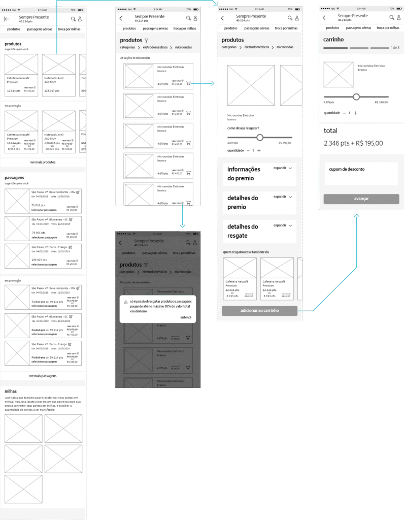
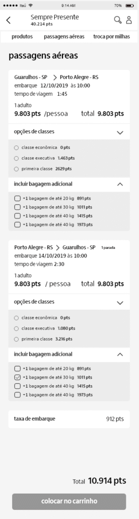
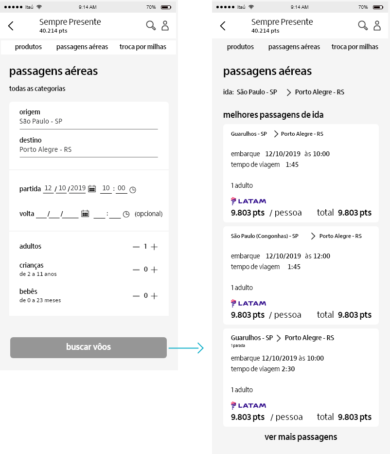
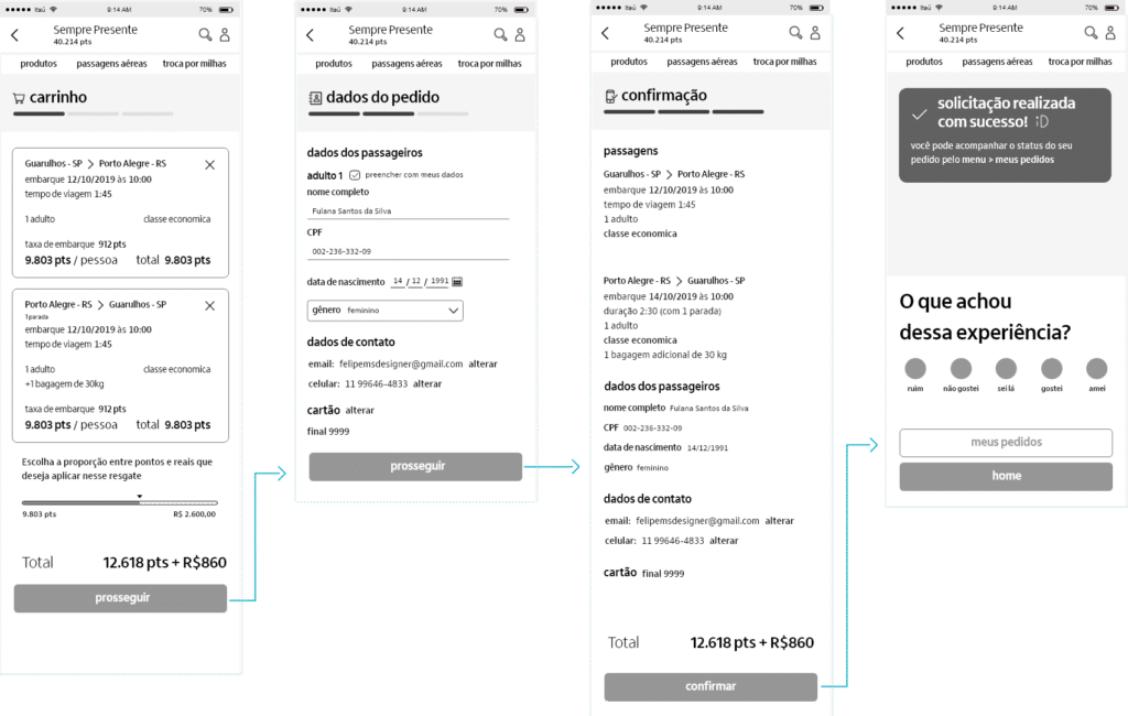
Project
(Aways Present)
Company:
Itaú Unibanco
Employer:
BRQ
Role:
CX designer
Workplace:
The Sempre Presente project is Itaú Unibanco’s credit card points program accessed via the Credcard app on mobile. Through this app, credit card customers can spend their accumulated points on purchases of products, airline tickets or miles.
Map the main customer pain points reported in the Likert scale and identify new areas for improvement.
Create an iteration plan to improve the customer experience based on the insights gathered.
Increase the app’s NPS score by at least 20 points.
The client (Itaú) trusted me to lead UX decisions for a team consisting of a PO, a Team Lead, a UI designer, and three developers. Although I led the project’s UX, I constantly reported my insights and decisions to the UX coordinator of this Itaú community.
When I joined the project, the Likert had several negative reviews and the NPS was at -19, indicating considerable user dissatisfaction. So we needed to figure out what factors were causing complications in the user experience.
Using the Card Sorting method, we grouped the comments into the following categories: general, search, product, airline tickets, miles and exchange. Then we assigned a score from 1 to 5 for the severity of the issues on each post-it. This helped us visually organize the pain points extracted from the Likert comments and understand their related categories, allowing us to identify the severity of each category’s impact on the customer experience.
Then we add up the points for each category and based on it
we establish
the initial priority for improvement:
To identify other problems that negatively impacted the user experience in the application, I applied a heuristic analysis to the three main workflows: Product, Airline Tickets, and Miles. Through this analysis, we identified several other usability problems:
1.
When a customer had a question during the product flow, such as about airline tickets or miles, they had to interrupt the flow to seek help and lost all the progress they had already made.
Affected Heuristics:
Help and Documentation
2.
The app’s notifications were hidden in a hard-to-reach location.
Affected Heuristics:
System visibility status
3.
The customer cannot easily move between the main flows: products, airline tickets, and miles.
Affected Heuristics:
User control and freedom
Recognition instead of memorization”
4.
The process of acquiring airline tickets is very long and lacks accuracy in its search for tickets.
This is due to:
– Searching for airline tickets takes a long time to return search results.
– the search is done by period instead of by time of day
– the customer cannot choose a class for each flight
– the customer has to manually fill in passenger data when the ticket is for themselves.
Affected Heuristics:
Flexibility and efficiency of use
User control and freedom
Therefore, I used semi-structured interviews, created from information obtained through card sorting and heuristic analysis, to deepen our understanding of the problems customers face when using the application.
Through the interviews, we validated the information obtained so far and discovered new insights.
With the new information obtained through Heuristic Analysis and user interviews, we realized the need to conduct a new collaborative workshop with the stakeholders involved to reassess the severity of the problems perceived by users and the usability issues in each category:
Therefore, I defined the improved features based on the difficulties faced by users and usability problems, prioritizing those that had the greatest weight in the card rating.
After defining the features, we held a meeting with the Product Owner and the entire team to prioritize their implementation using the impact vs. complexity matrix method. This method establishes a cost-benefit relationship between how much each pain point solved by the feature impacts customer usability and how long it would take to implement them.
Through the analysis performed in the planning phase, we defined seven priority features that offered the best cost-benefit ratio. The parameter used was usability impact – complexity = priority.
5
2
3
1. More accessible catalog notifications that alert users when their points are about to expire via the app and WhatsApp.
4
1
3
2. Configure the card app so that it doesn’t log the user out while they are in Sempre Presente flows, but requires them to log in again if they access other app functionalities outside of Sempre Presente.
4
2
2
3. Automatically save user progress in flows.
4
3
1
4. Implement a floating button to answer questions without leaving the flows.
3
3
0
5. Facilitate access to the main flows: product, airline tickets, and miles.
3
3
0
6. Automate the filling in of card details in shopping cart flows.
2
2
0
To optimize time and successfully design the proposed features within the sprint, after designing each feature in low fidelity, I conducted a moderate qualitative usability test to verify if it solved the user’s pain point and thus correct the problematic points in an agile way.
As we validated the solutions, I assigned the wireframes to the team’s UI designer so he could design the high-fidelity prototype within the sprint.
2
3
-1
8. Allow the customer to exchange part of the purchase for cash.
2
3
-1
9. Allow the customer to choose the airfare class per ticket instead of per exchange.
1
2
-1
10. Allow the customer to search for flights by approximate time instead of by period.
2
4
-2
11. Shorten the flow of air travel.
While we were designing the second iteration phase, the development team implemented the features designed in the first sprint.
After designing the experience for the features proposed in the second sprint, I conducted new moderated qualitative usability tests to validate the proposed solutions and make quick corrections before I assign the prototype to the UI designer to delve the solution into hight fidellity.
Since I left the project before the next iteration phase, I couldn’t suggest new validation methods to measure the app’s iteration success. However, I stayed in touch with the project team, and they reported that the project’s NPS went from -19 to 15 after the features were implemented. which indicates a considerable improvement in the customer experience.
This improvement were not planned at this initial stage because, despite having a considerable impact on the customer experience, they require in-depth study, which would take more time.
